
The goal was to create an identity for a one-person billing service that would reflect high-class and quality. A feminine touch was specifically requested along with the use of the client's initials. Colors had to be bold and professional. The client wanted a logomark that could be used universally as well as a business card design that incorporated the logomark.
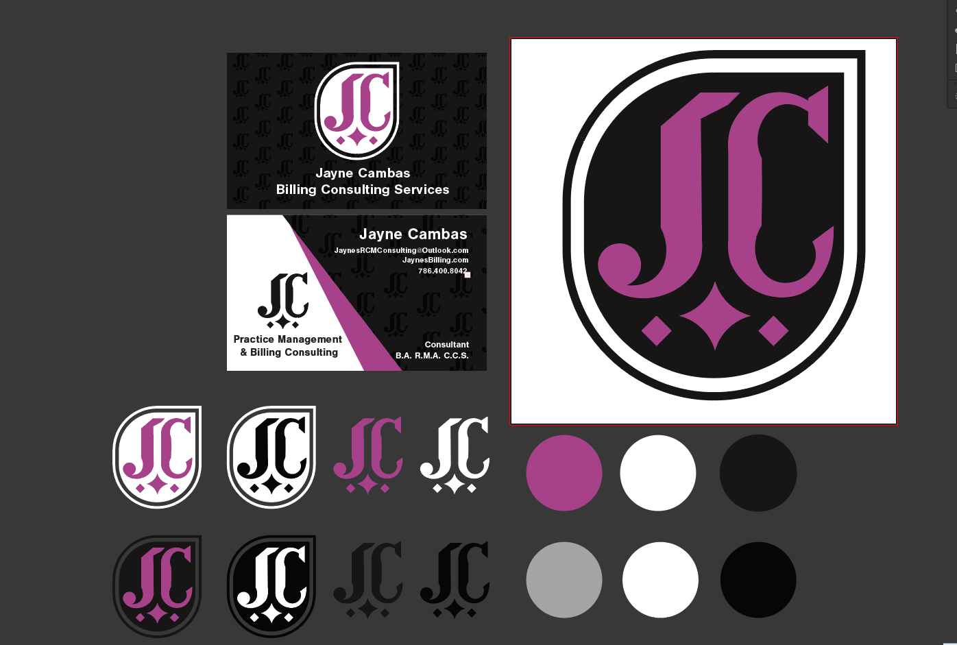
I focused on the curvilinear forms that are built into the initials combined with a condensed blackletter-style custom type.
For the color choice, I went with black and white as primary colors for their professional and universal adaptability. The tone of purple I chose is mauve as a highlight, a color that carries elegance and femininity and is based on the color of a mallow flower.
Finally, I enclose the logomark in a white rounded space that compliments the elliptical forms of the mark itself and then an additional outline to give the logomark room to breathe from any additional elements where it's used.
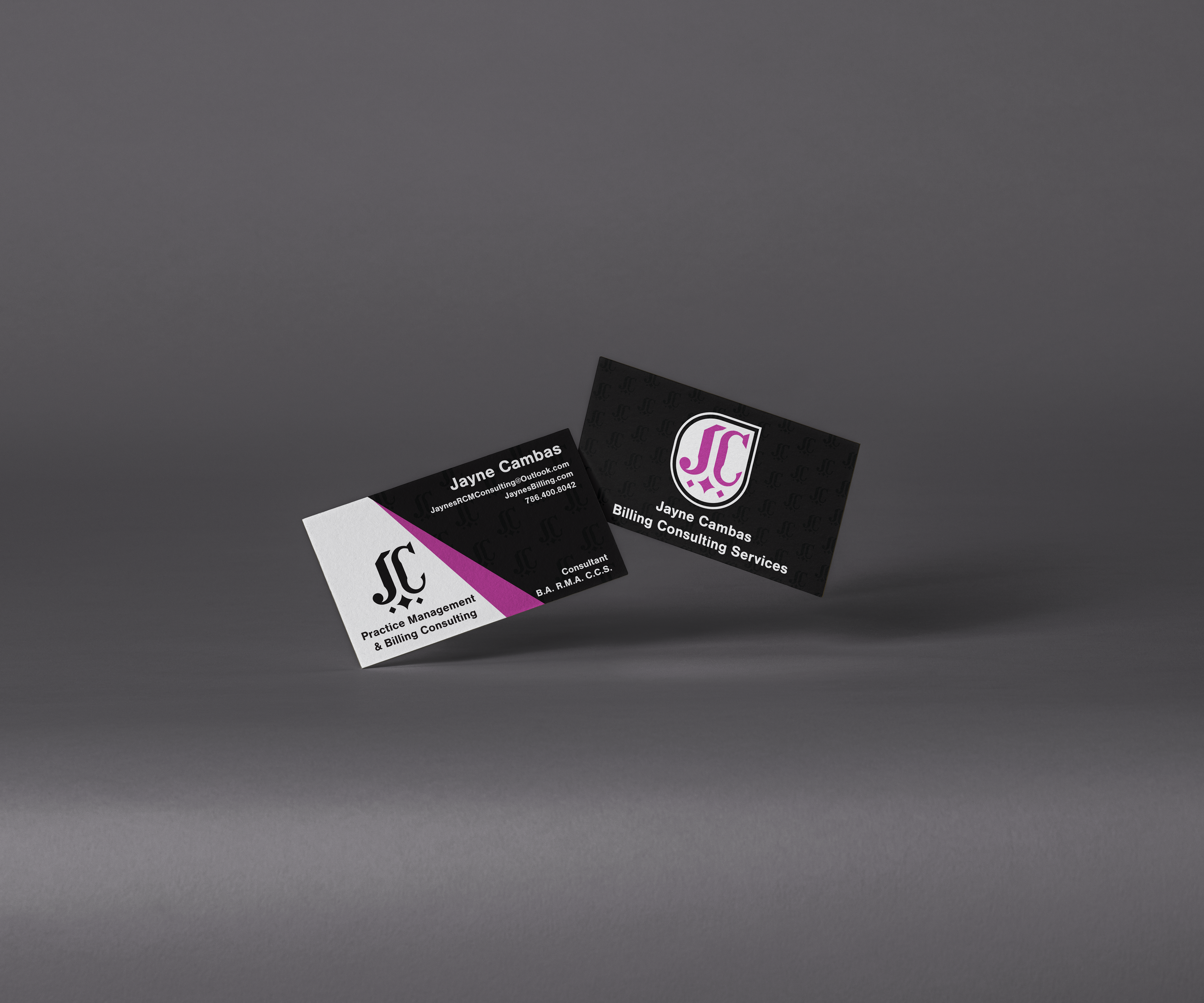
For the business card design, I wanted to apply the same themes I used for the logo: Simplicity and Elegance.
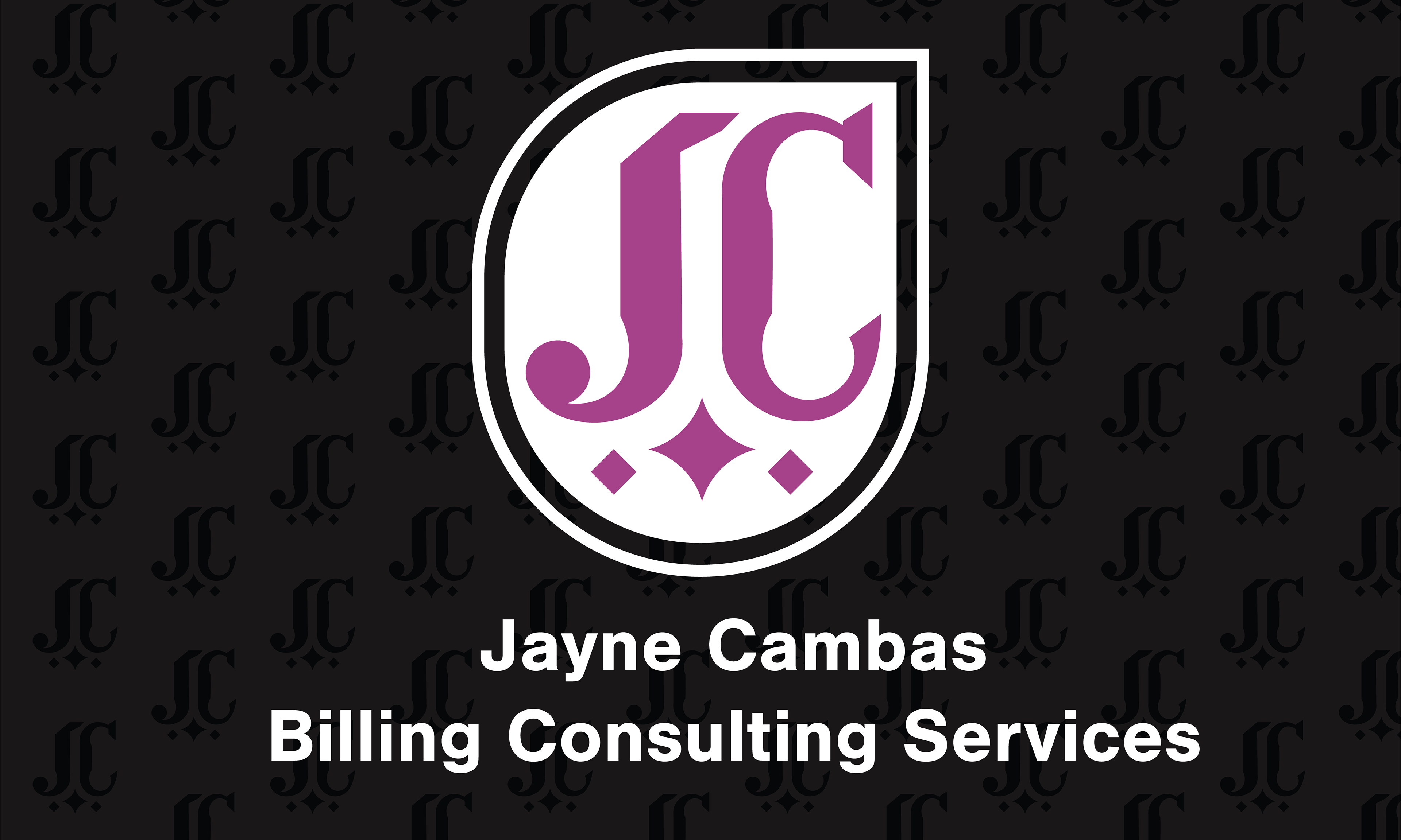
The backside would feature the logomark on black. In order to give the back more elegance I added subtle repetitions of the logomark as a pattern similar to the patterns seen on designer clothes.
The front side uses the mauve accent color as a dynamic cut between the content of the card. To create visual interest I used the logomark on white to balance the black on the right side. I continued the pattern of the back side to create a natural flow between the sides.
The typeface choice is Nimbus Sans, an Adobe-available font similar to Helvetica. The clean neutral readability of Nimbus Sans is perfect to balance the elegant ornamental logomark.